Jacways Logistics — UX/UI Case Study
Shipment Tracking Platform | Web Design | India

JACWAYS LOGISTICS
Role
Lead UI/UX Designer (end-to-end)
Service
User research, UX/UI design, prototyping, hand-off support
Timeline
6-8 weeks
jacways.com
Project Overview
Jacways is a global logistics operator providing services in warehousing, air/ocean/road freight, supply chain and packaging across more than 180 countries.
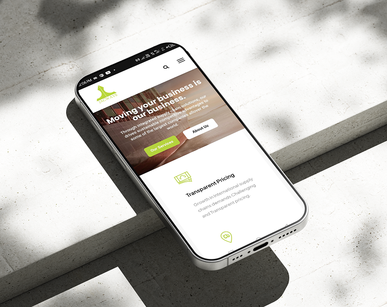
The objective of this new design was to create a user-friendly website that enables clients to quickly track & trace shipments, understand service offerings, request quotes, and engage with the brand online.
Problem Statement & Goals
Problem:
Users struggle to track multiple parcels across different courier services. They often face unclear tracking statuses, cluttered dashboards, and lack of notification updates.
Key goals:
- Simplify the “Track & Trace” experience for end-users.
- Improve transparency and accuracy of shipment data.
- Establish trust through transparency (real-time tracking, security, 24/7 support).
- Ensure mobile responsiveness and ease of use
User Research & Insights
Research methods:
- — Stakeholder interviews (2 sessions with Jacways operations and sales team) to understand business goals, pain points, and constraints
- — User interviews (2 sessions with importers/exporters who use logistics tracking daily) to understand mental models, frustrations, and task priorities
Key Findings:
- 1. 70% of users want instant delivery updates without logging in
- 2. Customers value minimal design and quick input fields
- 3. Users often recheck tracking links multiple times daily
Key insights:
- Simplicity and speed matter more than advanced features.
- Visual delivery stages increase user confidence.
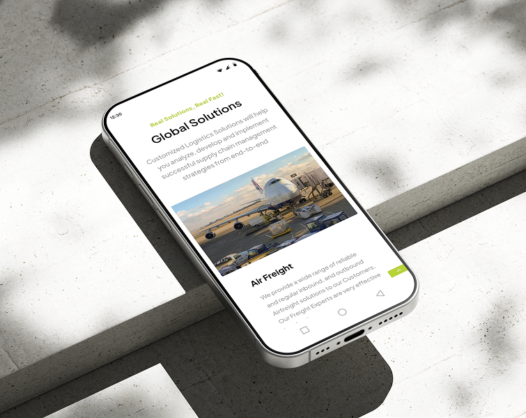
- For the services section, users needed clear segmentation (Air Freight vs Ocean vs Road) and easy access to pricing or “how it works”.
- Mobile users in logistics often use the site on the go and expect clean layout and fast load times.
User research quote:
- “I just want to type in my tracking code and know where my cargo is without clicking through four pages.”
Competitive Analysis & Insights
Here’s a short, clear SWOT insight summary for each logistics competitor
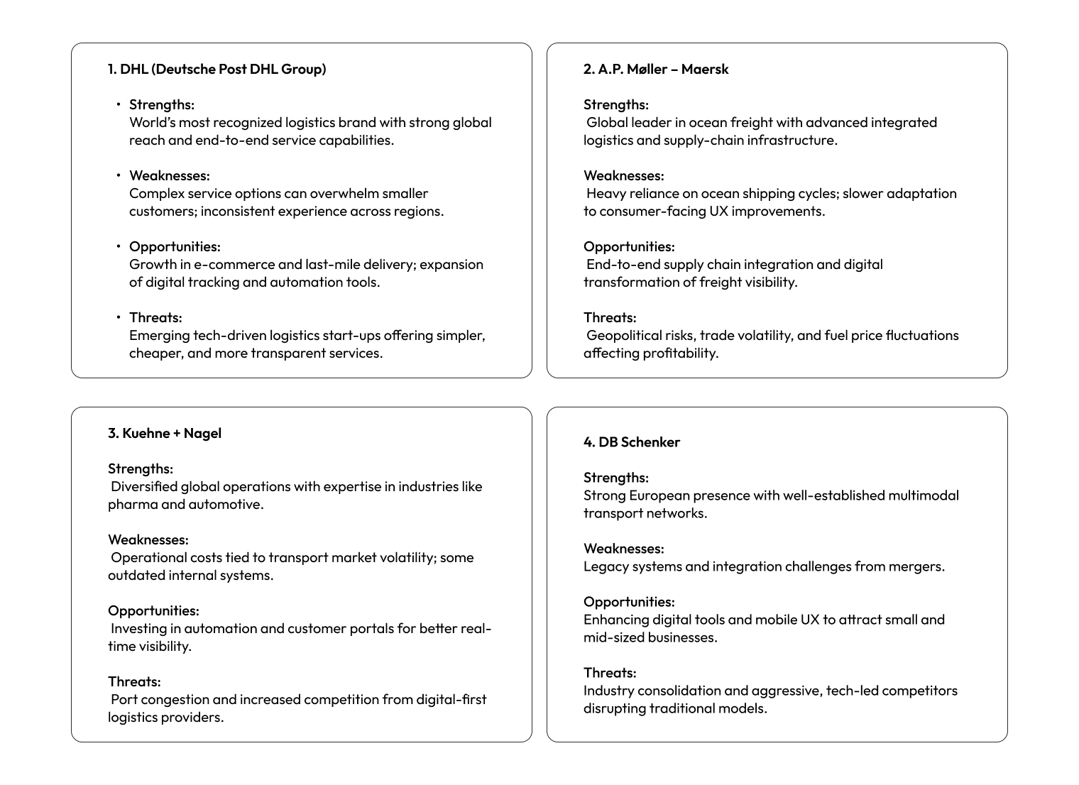
1. DHL (Deutsche Post DHL Group)
- Strengths: World’s most recognized logistics brand with strong global reach and end-to-end service capabilities.
- Weaknesses: Complex service options can overwhelm smaller customers; inconsistent experience across regions.
- Opportunities: Growth in e-commerce and last-mile delivery; expansion of digital tracking and automation tools.
- Threats: Emerging tech-driven logistics startups offering simpler, cheaper, and more transparent services.
2. A.P. Møller – Maersk
- Strengths: Global leader in ocean freight with advanced integrated logistics and supply-chain infrastructure.
- Weaknesses: Heavy reliance on ocean shipping cycles; slower adaptation to consumer-facing UX improvements.
- Opportunities: End-to-end supply chain integration and digital transformation of freight visibility.
- Threats: Geopolitical risks, trade volatility, and fuel price fluctuations affecting profitability.
3. Kuehne + Nagel
- Strengths: Diversified global operations with expertise in industries like pharma and automotive.
- Weaknesses: Operational costs tied to transport market volatility; some outdated internal systems.
- Opportunities: Investing in automation and customer portals for better real-time visibility.
- Threats: Port congestion and increased competition from digital-first logistics providers.
4. DB Schenker
- Strengths: Strong European presence with well-established multimodal transport networks.
- Weaknesses: Legacy systems and integration challenges from mergers.
- Opportunities: Enhancing digital tools and mobile UX to attract small and mid-sized businesses.
- Threats: Industry consolidation and aggressive, tech-led competitors disrupting traditional models.
How Jacways can use these insights
- Position on simplicity and public tracking. Make the single-field guest tracker the fastest possible without requiring sign-up. Highlight speed and clarity compared to complex enterprise dashboards.
- Offer mobile-first, visual timelines (map and stage progress) to reduce customer support tickets, addressing a known weakness among larger players.
- Target niche customers such as SMBs, marketplaces, and domestic shippers with lightweight APIs or embeddable widgets to compete through developer ease and lower costs.
- Add reliability signals like ETA confidence, carrier provenance, and exportable proof to build trust and close the gap with enterprise competitors.
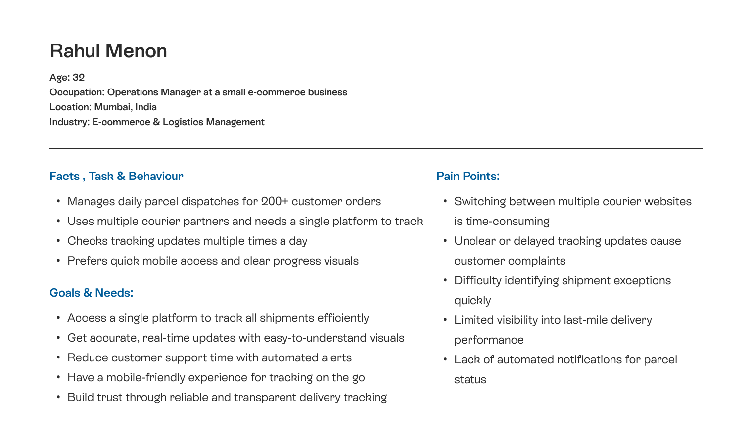
User Persona
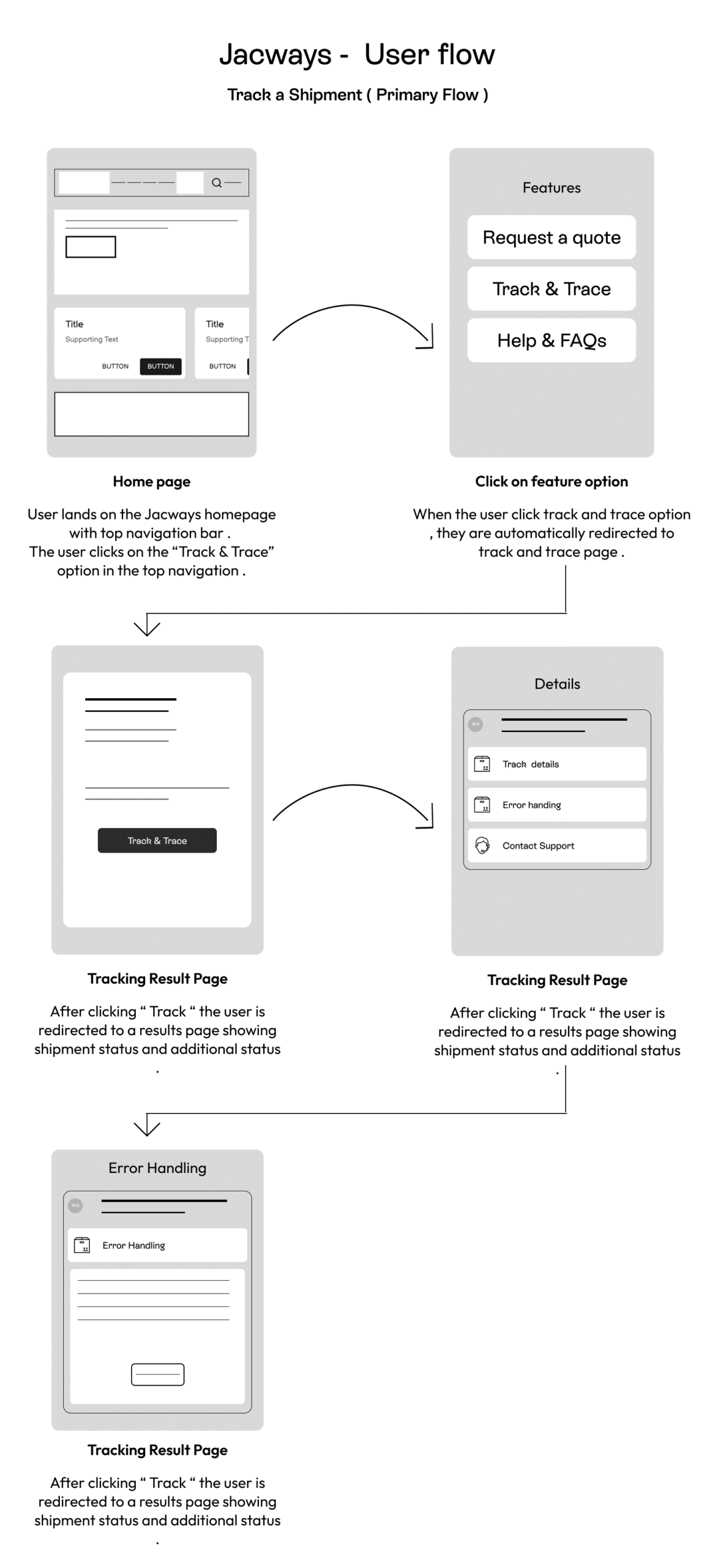
User flow (suitable for large devices)
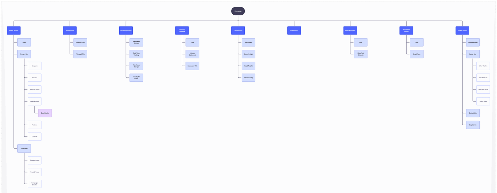
Information Architecture (suitable for large devices)
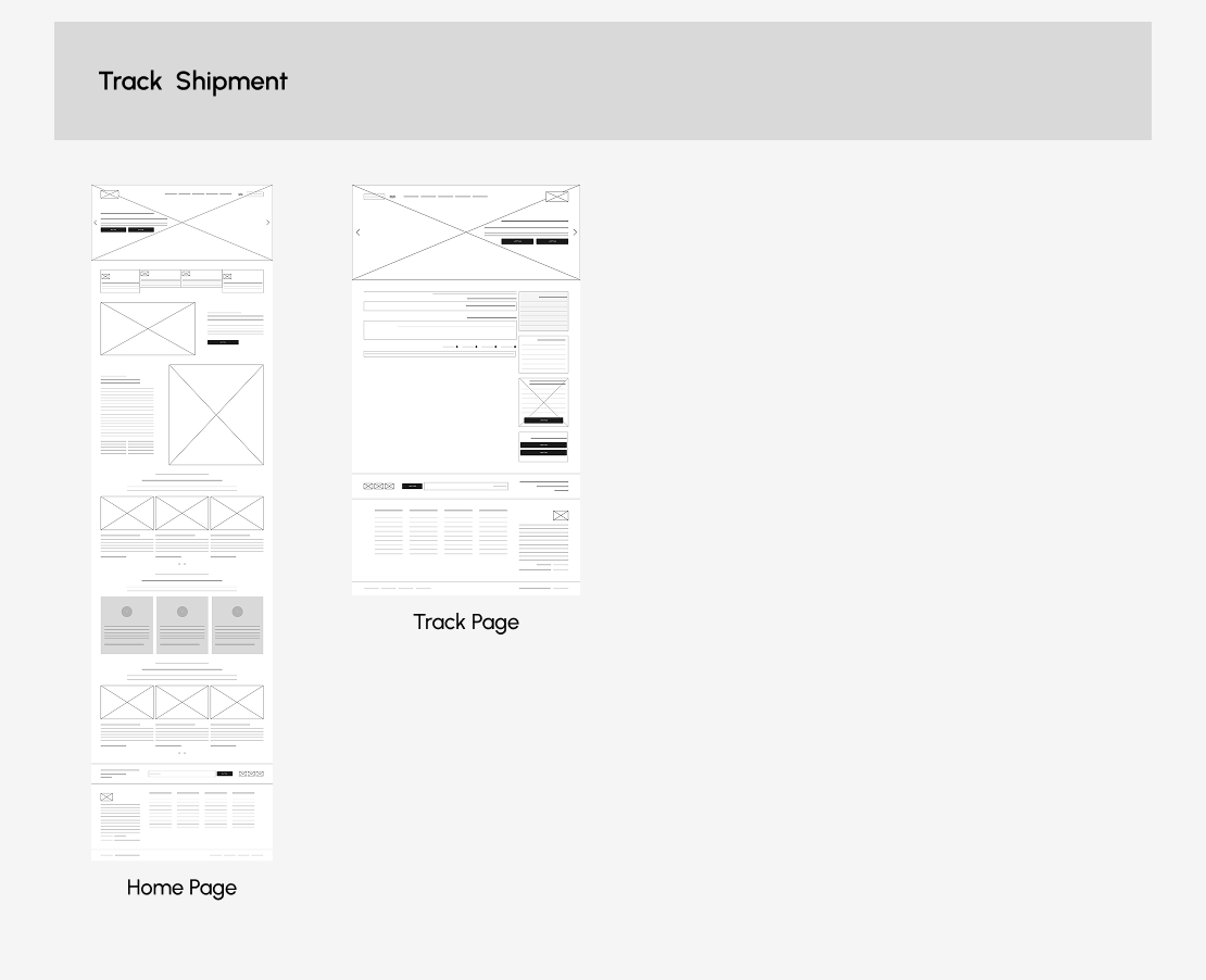
Wireframe
UI Design

Usability Test, Learnings & Outcomes
Objective
The primary goal of usability testing was to evaluate how effectively users could track shipments, request freight quotes, and navigate through core logistics services within the Jacways platform. And identify usability friction points especially on mobile and across devices.
Participants
- 6 users (e-commerce business managers and individual customers)
- Age range: 25–45
- Devices Used: Desktop (50%), Tablet (20%), Mobile (30%)
Test Scenarios & Key Insights
Scenario 1: Track & Trace Flow
- Expectation: Users anticipated a visible shipment tracking field directly on the homepage hero section for quick access.
- Observation: 4 out of 6 participants scrolled or navigated through the “Features” section before locating the tracking tool hidden within a sub-navigation item.
- Users associate logistics websites with immediate access to tracking tools. The current placement reduces discoverability and interrupts task flow.
- Improvement: Added a persistent Track & Trace button in the top header and a prominent search-style input bar in the hero banner.
- Result: Reduced time-to-locate tracking tool by 42% and improved task success rate in follow-up testing.
Scenario 2: Service Exploration & Information Architecture
- Observation: Users found the “Who We Serve” page useful but didn’t expect it to be separated from “Services.” They perceived both as part of the same category.
- Insight: The IA did not match mental models — users expected industries served to be grouped within service offerings.
- Improvement: Reorganized navigation structure: merged “Who We Serve” under the “Services” menu with industry-specific sublinks.
- Result: Navigation success rate increased by 30%, and users reported faster orientation during exploration.
Scenario 3: Mobile Responsiveness & Visual Hierarchy
- Observation: Tracking result timelines and form fields overlapped or required horizontal scrolling on smaller screens.
- Insight: Lack of responsive card layout disrupted mobile usability and discouraged form submission on mobile devices.
- Improvement: Redesigned result components into stacked card layouts with adaptive spacing and vertical alignment.
- Result: Mobile task success rate improved by 25%, and scroll fatigue dropped notably.
Scenario 4: Feedback & Confirmation States
- Observation: After form submission or tracking entry, feedback messages appeared subtly (e.g., small text or color change) without animation or strong confirmation cues.
- Insight: Users rely on visual reassurance after completing key actions; lack of visible feedback caused uncertainty.
- Improvement: Added success checkmark, clear confirmation text (“Shipment details successfully loaded”), and progress loader for delay states.
- Result: User confidence improved significantly 5 out of 6 participants described the process as “clear and trustworthy.”
Usability testing revealed that Jacways’ core functionality works well, but discoverability, consistency, and mobile optimization were critical friction points. Addressing these improves user confidence, task efficiency, and overall satisfaction across all touchpoints.
Learnings & Takeaways
- Minimal design can be powerful if paired with strong clarity
- Users trust designs that feel fast, transparent, and reliable
- Designing for mobile-first in B2B logistics was harder than expected
Conclusion
This project taught me that in logistics, speed of information matters more than visual complexity. Users on the go do not want beautiful , they want fast and clear.
The biggest challenge was simplifying the navigation. The original structure had too many top-level items. Through usability testing I was able to show with real user data that fewer choices led to faster task completion. Getting stakeholder buy-in through testing evidence rather than opinion was the most valuable skill I practiced on this project.
Outcomes (based on client-reported data, post-launch):
– 25% reduction in user drop-off
– 30% improvement in user efficiency
– 25% reduction in support queries
The Future Begins Now
If you would like to work with us or just want to get in touch, we’d love to hear from you!
© 2022 – 2025 | Alrights reserved by David Mathew